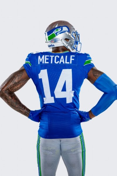
POLL: What's Your Thoughts On The Retros?

How do you like the new retro uniforms?

  • LOVE THEM!

    Votes: 94 71.8%
  • Pretty cool.

    Votes: 26 19.8%
  • Meh.

    Votes: 6 4.6%
  • Barf.

    Votes: 2 1.5%
  • I would have preferred it if...(Read my comments)

    Votes: 3 2.3%

  • Total voters
    131

Seahwkgal

Well-known member
Joined
Apr 30, 2009
Messages
5,104
Reaction score
208
I’d like them better if they used the current Angry Hawk design.

I completely understand the nostalgia but prefer our current uniforms.

Overall thumbs up.
I’m with you on the angry hawk design. They would have been awesome with the angry bird instead of the whimpy bird because the original colors and silver helmets are kick ass.
 
OP
OP
AROS

AROS

Administrator
Administrator
Moderator
Joined
Feb 23, 2007
Messages
19,197
Reaction score
8,174
Location
Sultan, WA
I think they wanted to leave a little silver between the modern facemask and the beak. With the hawk stretched out further they would touch and it would (likely) look less authentic.
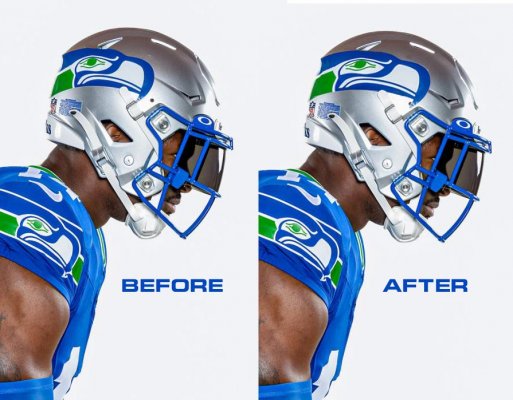
I think they could have made the stretch work. Here's a quick and dirty example...Note that the stretched version on the "after" side still doesn't touch the face mask but allows the whole logo to slide forward.

Beforeafter
 
OP
OP
AROS

AROS

Administrator
Administrator
Moderator
Joined
Feb 23, 2007
Messages
19,197
Reaction score
8,174
Location
Sultan, WA
"Wolf grey" always sounded cooler than it looked to me. I don't know about in the stadium, but on TV, the wolf-grey unis looked like poorly laundered white uniforms (like the utter disaster, which I hope will continue for some time, of the Rams' relatively recent hilarious logo redesign and uniform change). And during the game, sweat showed up on the wolf-grey uniforms in a way it didn't on any other uniform color.

100%.

Always thought they screwed up and should have made the grey color a couple shades darker.
 

RiverDog

Well-known member
Joined
Jul 8, 2013
Messages
5,601
Reaction score
3,302
Location
Kennewick, WA
I would have preferred it if they kept the angry bird of prey instead of whimpy Toucan Sam.
Hehe. I've always referred to that logo as the stoned seagull, but Toucan Sam seems more appropriate.

But nothing tops Tampa Bay's original helmet logo of the gay pirate along with the creamsicle uniform colors. No wonder they lost every game for two straight years.
 
OP
OP
AROS

AROS

Administrator
Administrator
Moderator
Joined
Feb 23, 2007
Messages
19,197
Reaction score
8,174
Location
Sultan, WA
I get the whole "stoned seagull" aspect but I still love it because it's our original logo and pays homage to the Pacific Northwest native americans, so stoned or not, I love that they went back to it for the retros. After all, what's the point of a throwback or retro uniform if you use your current logo? Doesn't make any sense to me. Outside of a few previously discussed issues, I think they did a fantastic job with the throwbacks.

PS, this isn't aimed at anyone in particular, just sharing my thoughts on the topic.
 

Chawker

Well-known member
Joined
Mar 30, 2010
Messages
5,395
Reaction score
1,337
Location
corner of 30th & plum
Well, Aros what ever the color, they still remind me of a pair of Dolfins pants,which sicken me to no ends. Like I said, they should of gone with silver pants.
 
OP
OP
AROS

AROS

Administrator
Administrator
Moderator
Joined
Feb 23, 2007
Messages
19,197
Reaction score
8,174
Location
Sultan, WA
Well, Aros what ever the color, they still remind me of a pair of Dolfins pants,which sicken me to no ends. Like I said, they should of gone with silver pants.

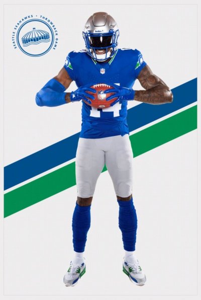
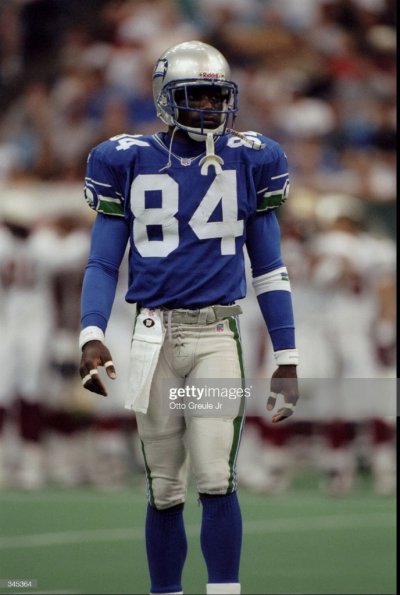
They are the same color of grey they were in the 90's...Although those initial first look gallery photos look white because of the bright white studio they were in when the photos were taken (second photo)...If you look at the other photos you can tell they are grey (third photo).

Joey galloway

Retros

997aa937893ae7e0 20230605  THROWBACKS MAR RM8 6521
 

onanygivensunday

Well-known member
Joined
Apr 14, 2010
Messages
5,815
Reaction score
1,786
I don't care for the powder blue of the jerseys. Reminds me of the Chargers jersey color.

The color of the jerseys should be Royal Blue.
 
OP
OP
AROS

AROS

Administrator
Administrator
Moderator
Joined
Feb 23, 2007
Messages
19,197
Reaction score
8,174
Location
Sultan, WA
Also, if you look at the photos I attached above, you can clearly see the royal blue they chose is a lighter shade than what we wore in the 90's.
 
OP
OP
AROS

AROS

Administrator
Administrator
Moderator
Joined
Feb 23, 2007
Messages
19,197
Reaction score
8,174
Location
Sultan, WA
If I were given control I would tweak the following...

1) Longer wrap around logo on the helmet. There's a good 2" or so closer towards the front of the helmet that could be gained before bumping into the face guard.

2) Change the face guard blue to a darker shade. (See 4 below).

3) Larger Seahawk on the sleeves. Even with the lack of sleeves on the modern jersey they could have still enlarged the logo.

4) Deeper, darker royal blue. The current shade is too light. Look at any photos of Seahawks players in the 90's and the jerseys are clearly a darker shade.

I am aware that the shades of color we are seeing may look different in person and/or on TV. You can tell those initial gallery photos the colors are washed out a bit by the extreme white backdrop and bright lighting they used. I'm sure they will look great on TV and in person at the games.
 

CallMeADawg

Well-known member
Joined
Dec 26, 2012
Messages
2,470
Reaction score
2,121
Yeah the more photos I see the more I really wish they made the helmet logo stretch so the main portion isn't resting behind the center part of the sides. They should have slid it forward another couple of inches. Ah well.

View attachment 59830

View attachment 59831
Looks like a gray helmet from the sports shop with a sticker slapped on it unevenly.
 

Chawker

Well-known member
Joined
Mar 30, 2010
Messages
5,395
Reaction score
1,337
Location
corner of 30th & plum
They should of consulted us first, thankfully we will be using them only once this season. We'll probably lose that game with the Chargers jersey and Dolphins pants.

I saw a side view of the pants and I threw up a little bit in my mouth. I still say those pants from side, have Dolphins written all over them. They should be silver not grey with just a blue stripe.

But thats just my opinion. Bigger logos on the arms too. My .02 $

Cheers
 

CallMeADawg

Well-known member
Joined
Dec 26, 2012
Messages
2,470
Reaction score
2,121
Those uniforms are awesome! hopefully they play like the 80s and 90s seahawks in them though. 😁 :p
Maybe Rick Flair will show up to our next game against you guys in the retro uniforms. 😂
 
Top