hugecanoli
Well-known member
- Joined
- May 1, 2009
- Messages
- 2,210
- Reaction score
- 3,206
Perfection


Love the old colors and the silver helmet. I just wish they had kept the angry hawk instead of Toucan Sam. Never cared for the old bird on the helmet. I always thought it looked whimpy. I know it’s based on totem pole design but the angry bird is so much better and BAD ASS.
Exactly this. The original Seahawks logo paid earnest respect to the Native American culture in the PNW. It is a lesson in the RIGHT way to incorporate said culture vs the team from the other Washington.I am really happy to see the new / old school uniforms. The original Seahawks logo "rings true" to me. The Pacific Northwest is rich with Native American history and culture. The old logo is a tribute to our past...I really prefer it!
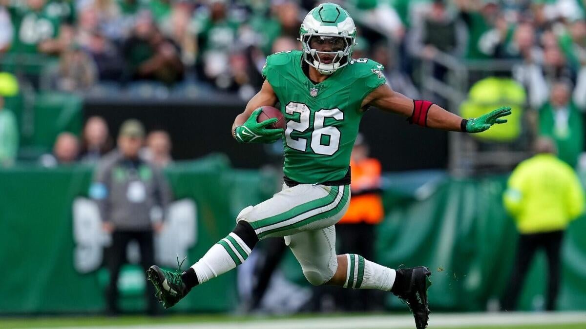
Does anyone know if they can wear them in the play offs/super bowl? Fast becoming my favorite jersey and I think the hawks should wear them full time.
The rule was changed this season. Teams are now allowed to wear throwbacks in the playoffs, but not the Super Bowl.Does anyone know if they can wear them in the play offs/super bowl? Fast becoming my favorite jersey and I think the hawks should wear them full time.
The rule was changed this season. Teams are now allowed to wear throwbacks in the playoffs, but not the Super Bowl.
 www.cbssports.com
Per this article, it looks like only alternate pants are allowed in the playoffs.Just came to post an article I found on this.
Just came to post an article I found on this
NFL updates uniform policy, allows teams to wear throwback or alternate jerseys more than ever before
Get used to seeing the Eagles' Kelly Green and the Bucs' creamsicles more often
How is the other Washington teamExactly this. The original Seahawks logo paid earnest respect to the Native American culture in the PNW. It is a lesson in the RIGHT way to incorporate said culture vs the team from the other Washington.
That's a fair point. I only know it's rubbed a lot of people the wring way for a long time. I'll go a step further and I don't think they meant the Redskins name as a slur in its time. But it is a slur now.How is the other Washington team
Not RIGHT?
The logo on the helmet is not a character but an actual chief and the artwork was by a native American.
The Washington Redskins logo, which featured the side profile of Blackfeet Chief John Two Guns White Calf, was designed in the early 1970s by Walter Blackie Wetzel, a former chair of the Blackfeet Tribe.
All good points.That's a fair point. I only know it's rubbed a lot of people the wring way for a long time. I'll go a step further and I don't think they meant the Redskins name as a slur in its time. But it is a slur now.
But someone would need to have a pretty long and girthy stick up the rear to get bent out of shape at the original Seahawks logo.