Check out this retro look

notyou

Active member
Joined
Sep 29, 2013
Messages
574
Reaction score
129
Kind of looks like the Detroit Lions blue over silver.
 

Maelstrom787

Well-known member
Joined
Jan 28, 2011
Messages
12,011
Reaction score
9,972
Location
Delaware
I remember this being posted in the infamous jersey thread in 2012. They were a popular mockup then, as well.

Personally, I think a throwback look should be relegated to an alternate set. The Seahawk color palette is unique to the NFL and should remain so.
 

RolandDeschain

Well-known member
Joined
May 1, 2009
Messages
33,140
Reaction score
974
Location
Kissimmee, FL
I'd be down with those. Just don't bring back our traditional "lazy eye" Seahawks logo. I can't stand it. It looks like a retarded bird who got hit in the head with a big rock.
 

Sports Hernia

Well-known member
Joined
Apr 30, 2009
Messages
44,755
Reaction score
3,372
Location
The pit
RolandDeschain":mo2eodae said:
I'd be down with those. Just don't bring back our traditional "lazy eye" Seahawks logo. I can't stand it. It looks like a retarded bird who got hit in the head with a big rock.
Agree. That’s called the “stoner hawk”. New logo is light years better IMHO.
 
OP
OP
IndyHawk

IndyHawk

Well-known member
Joined
Dec 19, 2013
Messages
8,068
Reaction score
1,708
Maelstrom787":3fm8uri7 said:
I remember this being posted in the infamous jersey thread in 2012. They were a popular mockup then, as well.

Personally, I think a throwback look should be relegated to an alternate set. The Seahawk color palette is unique to the NFL and should remain so.
Yes it has been here before and I tried to find it(no luck)
There is another version I'm looking for that I think is better.
The helmet had a shield and the uni was a little different than in here.
It also had the road version which was wicked.
I agree with no lazy Hawk on helmet.
 
OP
OP
IndyHawk

IndyHawk

Well-known member
Joined
Dec 19, 2013
Messages
8,068
Reaction score
1,708
Here is another.
 

Attachments

  • 5314758858_1cbb9d297d_b.jpg
    5314758858_1cbb9d297d_b.jpg
    137.1 KB · Views: 1,278

idle Eric

New member
Joined
Jan 18, 2017
Messages
50
Reaction score
0
Location
England
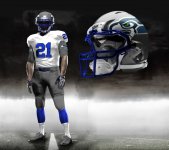
It's Not Retro. It's a mixture of old and new. The NFL have got it right on this one, when they go retro uniforms it's a chance to see the current team in a genuine old style. A chance to see the current players in an historic old uniform with all the history and nostalgia that brings. To me it's important to get the uniforms exactly authentic. That blue on the original photo is so wrong and obviously stick to the old logo. I'm sure if they do it this season they'll do it right and it will be great to see !
On the subject of Seahawks blue, can anyone tell me why the 12s flag has such an odd color blue ? It doesn't seem to be any blue they've ever played in. I always thought it was an attempt to reproduce the royal blue of the original uniform that had failed. The 12s flag is consistently that color, just wondered if anyone knew...
 
D

DomeHawk

Guest
notyou":196eteo5 said:
Kind of looks like the Detroit Lions blue over silver.

Initially, when the Seahawks were formed in '76 they were trying to emulate the Dallas Cowboys as a symbol of success. The uniforms were fashioned after their uniforms as well. Not exactly but you can definitely see the similarities.
 

notyou

Active member
Joined
Sep 29, 2013
Messages
574
Reaction score
129
Yes, but would you like our new uniforms to be emulating a craptastic team like the Lions?
 
Joined
Mar 3, 2007
Messages
634
Reaction score
1
Location
Sinking Spring, PA
Nice "mock-up" of the retro uniforms. :2thumbs:
But to separate the look from a Detroit Lions uniform,
YOU MUST ADD the green/blue striping down the sides of the pants !!? :les:
 

Latest posts

Top