Browns Unveil New Uniforms

Kennewick_Man

New member
Joined
Sep 8, 2013
Messages
22
Reaction score
0
"The words "Dawg Pound" are stitched on the inside of the neck, to represent the fans always being behind the team."

...imitation is the most sincere form of flattery.
 

NJSeahawk

Active member
Joined
Oct 13, 2009
Messages
3,977
Reaction score
13
Location
New Joisey
Kennewick_Man":40izhfs9 said:
"The words "Dawg Pound" are stitched on the inside of the neck, to represent the fans always being behind the team."

...imitation is the most sincere form of flattery.

cleveland fans bleed brown and orange, I will give them that.
 

irocdave

New member
Joined
Dec 21, 2011
Messages
1,481
Reaction score
1
Slight improvement over the classic understated uni's. JMHO, Hawk fans shouldn't be poking fun at Browns fans. They have been die hard loyal fans for way longer than the Hawks have been around. Imagine if the Hawks stayed in LA when that POS that shall not be named got his way and they won a SB within a couple of years. That's what happened to the Browns fans. I have sympathy for Browns fans. Seattle used to be compared to Cleveland fans when dedicated deserving fan bases that are starving for a championship were discussed or polled in the lame stream media.
 

rideaducati

New member
Joined
Jul 25, 2012
Messages
5,414
Reaction score
0
Vetamur":1zf8vwi3 said:
Offseason: when Seahawk fans discuss the uniforms of AFC Central teams. :)

I think they are pretty sharp but I could do without the "Cleveland" across the chest.....

Well if they didn't put "Cleveland" across the chest, no one would know what team they were.
 

Sports Hernia

Well-known member
Joined
Apr 30, 2009
Messages
44,755
Reaction score
3,372
Location
The pit
Largent80":2soc7wis said:
253hawk":2soc7wis said:
Cleveland really needs a mascot on the helmet.

Mr. Hankey with a helmet.
Thread winner!
LMAO!

I think it's a slight up grade. I'm just not a fan of the "old school style".
I like the Hawks look in the "Easley era" better than the teams that have the old school look, and I think the current Hawks look runs circles over any previous hawk unis.
 

NJSeahawk

Active member
Joined
Oct 13, 2009
Messages
3,977
Reaction score
13
Location
New Joisey
All things considered, when orange, brown, and white are your colors, these new unis are a work of art.
 

HansGruber

New member
Joined
Mar 7, 2012
Messages
2,740
Reaction score
0
Love the new uniforms and Cleveland was my favorite place to see a road game so far. Browns fans are awesome. They deserve better ownership.
 

NJSeahawk

Active member
Joined
Oct 13, 2009
Messages
3,977
Reaction score
13
Location
New Joisey
HansGruber":ldbofd1h said:
Love the new uniforms and Cleveland was my favorite place to see a road game so far. Browns fans are awesome. They deserve better ownership.

That stadium is also quality. Beautiful stadium.
 

dopeboy206

Active member
Joined
May 7, 2013
Messages
1,114
Reaction score
9
253hawk":3isz29l5 said:
That looks high-school/fake-pro-team-in-a-movie as hell. At least Tampa Bay can feel good about not looking the worst in the league now.

Cleveland really needs a mascot on the helmet.
Really? Those uniforms looks amazing!
 

Our Man in Chicago

New member
Joined
Dec 29, 2013
Messages
1,188
Reaction score
0
My take, as someone with a design degree:

Background:
I was a fan of the original uniforms, which might not have had everyone's favorite palette, but they exuded class, simplicity, and history. Everyone knew who the Browns were; they didn't (and don't) need a helmet logo. The Browns kit was never the best in the league, but Top 13, in my book. Also: winning has a way of making most uniforms look better, if not good. Take our team, for example.

New uniform cons:
This uniform represents several needless steps back from the previous iteration. The name on the chest is HS/College all the way. The team name running down the leg - a first in the NFL to my knowledge, despite many patterned/logoed predecessors - is reminiscent of a 1990s running tight/cycling short design. The numbers on the back are too large, and due to their ostensible texture, their color is tweaked off the spot standard. The letter shadowing doesn't work with the Cincinnati Bengals, and it doesn't work here with the Browns, due to the 2D standard the team set and exuded. The contrast stitching - not necessarily a bad feature in itself - becomes unnecessary with the NOC and the oddly textured numbers. The font, even taking into consideration the historical logotype, is boring - especially on the chest, where it draws the most attention.

New uniform pros:
I like the helmet better. More assertive stripes, bolder colors. The sleeve stripes are also assertive in a league that is doing away with the traditional sleeve indicia. The colors weren't over-tweaked. Silver, as had been reported, is also not a dominant color.
 

Seahawks1983

New member
Joined
Jan 7, 2013
Messages
915
Reaction score
0
Location
509
Those look terrible, and incredibly dated. Drop shadowing is an early 2000s trend that should never be brought back.

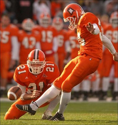
They essentially stole the uniform design of Bowling Green circa 2000:

Alcons notebook Offense sputtered only in red zone
 

morgulon1

Well-known member
Joined
May 2, 2009
Messages
7,890
Reaction score
3,759
Location
Spokane, Wa
drcool":2s7fmm98 said:
The brown jerseys have an orange stitching detail on them that looks pretty cool. I think they kept these classic enough but were still able to modernize them enough. Much better than the Buccaneers or Jaguars redesigns.

yep
 
Top