raisethe3
Active member
- Joined
- Oct 13, 2013
- Messages
- 869
- Reaction score
- 61
I dig the jerseys.
I voted for the silver helmets. Someone told me it was always going to be the blue . I always hated that.For the record years ago they had a vote for Blue or Silver helmets, and I voted for silver. Hope the NFL lets us go back to them. Apparently the eagles tried to go back to silver and green, and the NFL told them no.
You're not alone. I think most people like uniforms that aren't monochrome. The combo in the op looks like the best option, maybe with a few tweaks. The retro uniforms were hands down the bestI’m alone but I like the new blue and the silver combo. I also love the retro colors but I wonder if they have to have some version of their current colors? Not sure how that works but I like it lol
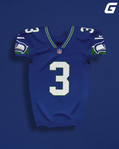
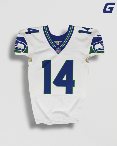
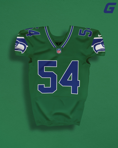
You know this is just a mockup, right?This is God awful.
Either go traditional or don't. This has no identity. Two different types of striping for no reason. Number placement is off on the front.
Your uniform should never be confused about what design school it belongs to or what impression it is meant to impart. This is a mess.
Yeah. With some tweaks this look would be crazy dope to me.That particular rendering is just some rando's take. It's doubtful to be a true representation of the tones and PMS codes the team would go with. Just an approximation. For the record, give or take some design elements, I'm all for that update!
You're the first person that I have EVER heard say that.I really like it!
They should have two helmet colors and also include the original vintage blue, green and silver into the overall color scheme.
But. I think that the silver helmet should have the original Seahawks logo. The PNW native artwork inspired logo not only looks cool, but to me, looks "mysterious, inspirational and maybe tougher" than the current frowning Seahawk.
I read the original rumor they're based on, the deleted Reddit post. The mockup is slightly off, but is generally a pretty good representation of what was posted. It's just total identity crisis.You know this is just a mockup, right?
I kinda agree. The original green is best.I"m tired of the neon green... looks old and dated anymore
Oh ok. I was just going off of your disdain for the "2 different stripes/number placement" comments. I'm positive that the numbers will be centered, and pretty sure that the designers will stick to one theme for the striping and other ancillary details. But, then again, I ain't in the design room (as awesome as that would be), so what do I know?I read the original rumor they're based on, the deleted Reddit post. The mockup is slightly off, but is generally a pretty good representation of what was posted. It's just total identity crisis.
Yeah, if the Reddit rumor is true, then they'd just be going with a new hybrid throwback/modern top that combines the throwback sleevehawk and number font with the sublimated feather pattern on the numbers, and that's going over our exact pants we already wear, just slightly color-corrected.Oh ok. I was just going off of your disdain for the "2 different stripes/number placement" comments. I'm positive that the numbers will be centered, and pretty sure that the designers will stick to one theme for the striping and other ancillary details. But, then again, I ain't in the design room (as awesome as that would be), so what do I know?


