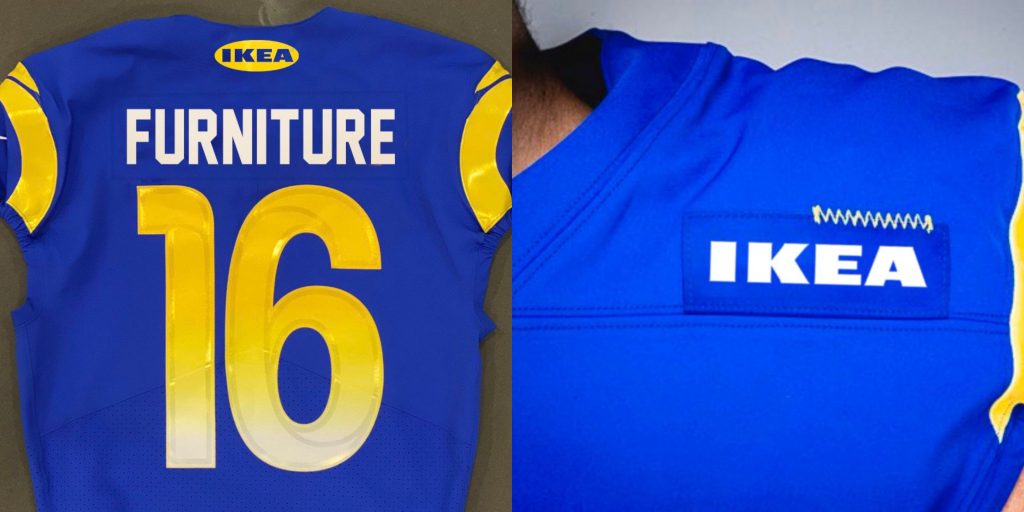
They look like a corporation's idea of a minimalist design, the gradient numbers, as with every gradient, are ugly, and they tried really hard to rip off our Wolf Greys, but they're not different enough from their whites to matter. I like the shade of blue, though.
The Chargers have pretty handily won the 2020 uniform redesign contest. The Rams and Falcons look stupid and corporate, the Browns and Bucs just hit the reverse button away from their awful redesigns, the Colts are as boring as ever, and the Patriots, while improved, still look pretty dull. The Chargers, though, they got it right.












 ukeface: