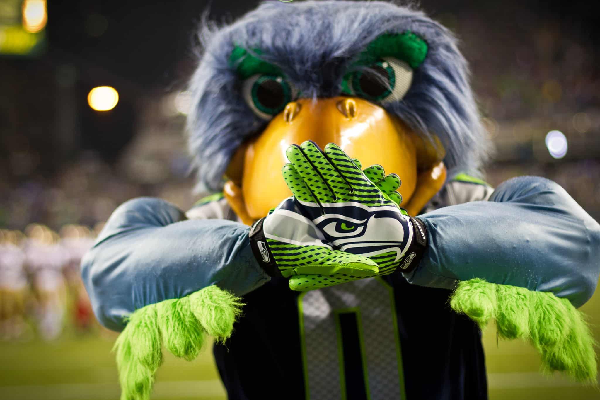
I'm not disrespecting the logo per se. What I am saying is that it is inappropriate for a football logo, that it projects a laid back, casual, geek-ish atmosphere, not the aggressive, smash mouth style we identify with as being American football in general and Seahawks football specifically. It's a personal opinion, no more and no less.
I don't know how this discussion ever perverted into such a contest between personalities. All I said was that I could do without the stoned seagull, which is a characterization of the logo that I did not create and is part of Seahawk urban language, if one exists. Yet I get told by a mod that I gotta get over it. SMH.


