Throwbacks Week 1

Maulbert

Well-known member
Joined
Apr 8, 2014
Messages
9,217
Reaction score
2,426
Location
In the basement of Reynholm Industries
Seems like I remember that twice is the limit, and that it has to be determined before the season.

Easily could be wrong though
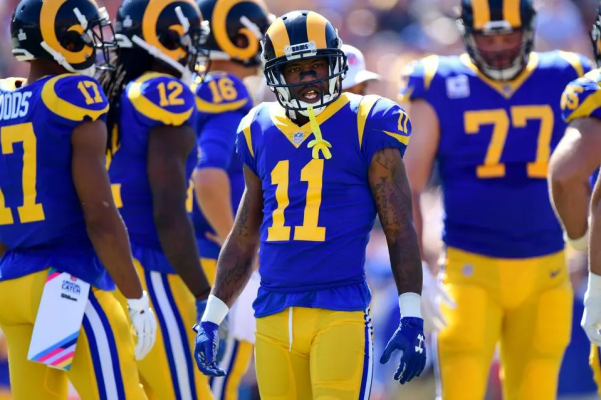
Yes, though in 2018, the Rams chose to designate their throwbacks, which had been alts, as their home jerseys. It led them to a really weird year where they wore blue jerseys with yellow trim and numbers and yellow pants with navy helmets and yellow horns at home, and white jerseys with gold trim and navy numbers with white pants with navy trim and navy helmets with white horns on the road. The league will allow a designation change with an existing set.

Ezgif 6 575f1d6408

Ezgif 6 e76dcc2caf
 
Last edited:

seabowl

Well-known member
Joined
Aug 16, 2009
Messages
5,381
Reaction score
2,601
Saw them practicing today in throwback silver helmets. I bet these are the look game 1!!!!!!
 

AROS

Administrator
Administrator
Moderator
Joined
Feb 23, 2007
Messages
21,038
Reaction score
13,050
Location
Astoria, OR
I can do without the stoned seagull.

No disrespect honestly but IMO ya gotta get over it.

Yeah, yeah, I get it. "Stoned, Hungover Seahawk logo"...It's actually paying homage to Pacific Northwest Native American artwork which is why I honestly think our logo is the coolest in the league.

I usually am not a fan of telling fellow fans how to think or feel but in this case I cringe when I hear that narrative.

Embrace the history, the culture of where that logo originated from. I am not trying to point you out specifically, but ANY fan that has that mindset.

Original or current, our logo has a true history originated in the indigenous people that lived in the Pacific Northwest long before the settlers.
 

LeveeBreak

Well-known member
Joined
Oct 2, 2022
Messages
2,067
Reaction score
2,483
Location
Oregon Wine Region
Wifey and I decided 2 weeks ago to do the home opener this year. Great news on the throwbacks.

I too m in the minority of liking our green jerseys. I’ll take blue of course, but greens are cool IMO.
 
Last edited:

SNDavidson

Well-known member
Joined
Sep 29, 2009
Messages
2,925
Reaction score
815
They should wear them at least two more times and just take the fines
 

RiverDog

Well-known member
Joined
Jul 8, 2013
Messages
6,175
Reaction score
3,908
Location
Kennewick, WA
No disrespect honestly but IMO ya gotta get over it.

Yeah, yeah, I get it. "Stoned, Hungover Seahawk logo"...It's actually paying homage to Pacific Northwest Native American artwork which is why I honestly think our logo is the coolest in the league.

I usually am not a fan of telling fellow fans how to think or feel but in this case I cringe when I hear that narrative.

Embrace the history, the culture of where that logo originated from. I am not trying to point you out specifically, but ANY fan that has that mindset.

Original or current, our logo has a true history originated in the indigenous people that lived in the Pacific Northwest long before the settlers.
Sorry, man. There are some things I don't like to look at in relation to my football team, and along with the florescent puke green uniforms, the stoned seagull is one of them.

And if your opinion is so much superior and righteous than mine, then why did they change it? My POV is not an outlier or else would still be on the helmet, would it not? Lots of teams change their uniforms and color schemes, but not many change their logos.

If you're looking for someone to displace your angst, better find out who approved that change and read them the riot act.
 

chris98251

Well-known member
Joined
Feb 27, 2007
Messages
40,591
Reaction score
2,918
Location
Roy Wa.
Part of the reason was leaving the bad memories of Behring behind and going forward with a new identity as a team. They updated the logo to be more aggressive, not to forget its origins.
 

RiverDog

Well-known member
Joined
Jul 8, 2013
Messages
6,175
Reaction score
3,908
Location
Kennewick, WA
Part of the reason was leaving the bad memories of Behring behind and going forward with a new identity as a team. They updated the logo to be more aggressive, not to forget its origins.
Agreed. It wasn't a 'football' look. We left it behind in part for the same reason that the Bucs left their gay pirate behind. They wanted something that looked more intimidating and that belonged on a football field, not in a museum.

And absolutely it was about creating a new identity for the team. As I recall, there weren't very many objections to the new logo. The biggest objections I heard was about the inclusions of the Nike swoosh on the jerseys.
 

Ad Hawk

Well-known member
Joined
Sep 6, 2011
Messages
3,325
Reaction score
566
Part of the reason was leaving the bad memories of Behring behind and going forward with a new identity as a team. They updated the logo to be more aggressive, not to forget its origins.

While I understand the native history, and respect it, the new logo is certainly more aggressive. The uniforms in 2012 introduced more of the northwest cultural elements (with tributes to the 12s, "12th Man" at that time) while retaining the new logo. I'm good with the new, and still respect the old.

The throwbacks are dope; having both now is win-win. And we can/should triumph in each uniform!
 

AROS

Administrator
Administrator
Moderator
Joined
Feb 23, 2007
Messages
21,038
Reaction score
13,050
Location
Astoria, OR
Sorry, man. There are some things I don't like to look at in relation to my football team, and along with the florescent puke green uniforms, the stoned seagull is one of them.

And if your opinion is so much superior and righteous than mine, then why did they change it? My POV is not an outlier or else would still be on the helmet, would it not? Lots of teams change their uniforms and color schemes, but not many change their logos.

If you're looking for someone to displace your angst, better find out who approved that change and read them the riot act.

Get over yourself. Seriously.

PS, congrats. You're the first member I've put on ignore in years. So don't bother responding. I won't read it anyways.
 

SoulfishHawk

Well-known member
Joined
Sep 6, 2012
Messages
35,927
Reaction score
16,930
Location
Sammamish, WA
Sorry, man. There are some things I don't like to look at in relation to my football team, and along with the florescent puke green uniforms, the stoned seagull is one of them.

And if your opinion is so much superior and righteous than mine, then why did they change it? My POV is not an outlier or else would still be on the helmet, would it not? Lots of teams change their uniforms and color schemes, but not many change their logos.

If you're looking for someone to displace your angst, better find out who approved that change and read them the riot act.
200
 

Aircrew

Well-known member
Joined
Sep 25, 2016
Messages
1,191
Reaction score
2,235
Location
Eastern Washington
No disrespect honestly but IMO ya gotta get over it.

Yeah, yeah, I get it. "Stoned, Hungover Seahawk logo"...It's actually paying homage to Pacific Northwest Native American artwork which is why I honestly think our logo is the coolest in the league.

I usually am not a fan of telling fellow fans how to think or feel but in this case I cringe when I hear that narrative.

Embrace the history, the culture of where that logo originated from. I am not trying to point you out specifically, but ANY fan that has that mindset.

Original or current, our logo has a true history originated in the indigenous people that lived in the Pacific Northwest long before the settlers.
I'm with you on this, Aros. Embrace your history, kick some ass and make it cool again.
 

Latest posts

Top